We all know that appearances can be deceptive.
For generations, mothers the world over have been endeavouring to help their children understand that every uniquely created individual is precious and important, and shouldn’t be accepted or rejected simply on the basis of their appearance.
And yet, we all know that there are social groups divided purely on the physical attributes of their members. Remember the teen movie, Mean Girls? The geeks, the jocks, the plastics, the boffins… These are not collectives exclusive to the American High School; we’ve all met them at school and beyond. The beautiful people are the ones who, as I recall from primary school, seem to land the best parts in the play, have the teachers’ ear, get away with not completing their assignments and take on the mantle of Queen Bee in the playground dynamics.
It’s alarming to enter the adult world and find that nothing much has changed.
Hollywood – currently addressing it’s own more literal version of the headline-grabbing Oscars version of ‘packing a punch’ – certainly didn’t get the memo. Neither did social media. I’ve lost track of how many accounts consist of ‘selfies’, primped, primed, photo-shaped and curated to within an inch of their lives. Now, we all know this is a fantasy world, but somehow our visceral reaction is, far too often, to compare and there lies danger.
It’s not a surprise; after all, I’m sure no one would want to scroll through images of any of us with that first-thing-in-the-morning bed-head look. Nevertheless, we tend to jump to conclusions about people on our screen, on our commute or in the supermarket, based on what they look like. I’ve never been on a dating site, but quite clearly the whole ‘swipe left’ culture depends entirely on the first impression of a particular, carefully chosen, curated image, which is why it seems distasteful to so many.
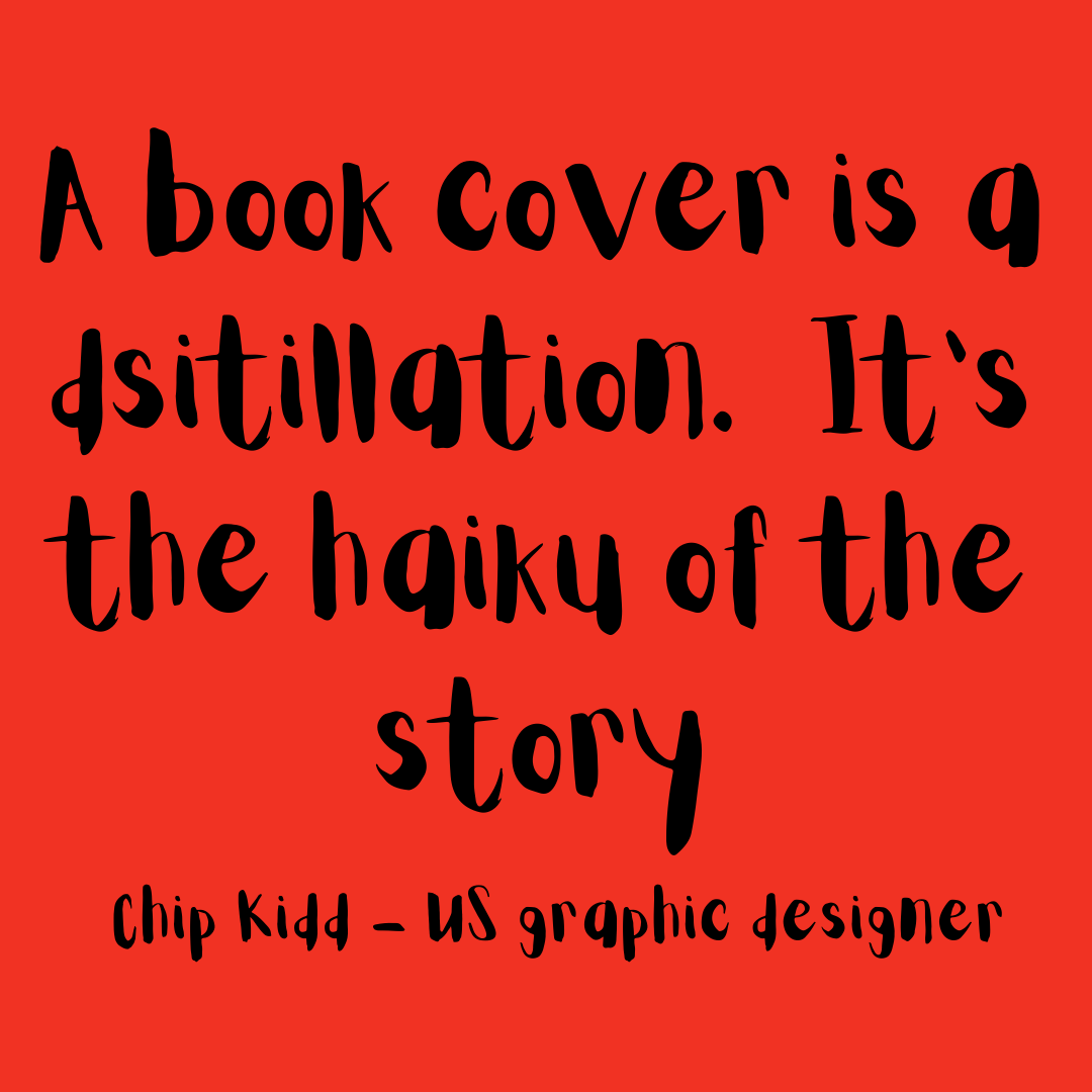
However, when it comes to the books we read, it’s a different story.
Yes, we read the blurb on the back, but the fact is that in the time it takes for us to decide if we want to purchase a particular book, whether fiction or non-fiction, it’s the cover that sways us.
While it’s also true that you might choose a book based on whether you’re already familiar with the author, have read other books in the series, seen reviews that piqued your interest or have heard an interview with the writer, for most people it’s the cover that counts.
And this is exercising my brain considerably at the moment as the designers at The Conrad Press work hard on my behalf to come up with a cover that we’re all not just happy with, but which gives us a bit of a buzz.
This is far more of a challenge than I appreciated. My previously published book has a cover I love, but the first one which the publisher sent to me made me cry (it was a tough week coinciding with a cancer diagnosis, a speaking engagement and a trip that required some complicated logistical planning). I’m so grateful that it was changed before it went to press (Thank you to the team at Instant Apostle).
New book; new genre; new publisher. How is this going to work, I wonder? The cover needs impact, focus and simplicity but also requires colour, an appropriate font, a powerful composition. I’ve scratched my head, done some research, doodled ideas, binned ideas, thought some more and basically decided that they have considerably more experience in this field and that, therefore, I should listen before I speak. Good advice for life there.
So, together I am expectant that we’ll come up with a cover which delights us all and catches the eye and the purchasing power of potential readers. The process is exciting and has certainly made me more aware of why some books jump out at me and others simply don’t. What appeals to you about a book cover, I wonder?
Meanwhile, I’ll try to remember that the ironic mantra of mothers: ‘Don’t judge a book by it’s cover’, applies to almost everything except books.
